The Fix Was Framing, Not Editing
The Fix Was Framing, Not Editing
The last one in this run, and it's about a small problem I solved twice — once badly, once properly.
The problem
We'd had the analyst character rendered: a snail in a reed sun hat and a canvas apron, warm creams and soft browns, painterly and hand-illustrated. At full size it's lovely. Shrunk to a 64-pixel avatar it still held together, which is the real test, because most detailed illustrations turn to soup at that size.
Then I put it on a light background. It dissolved.
The character is mostly pale cream and warm sand. A white or near-white background gives those tones nothing to sit against, so the edges stopped existing. On a dark background it was fine. On a light one it was a vague pale smudge in the shape of a snail.
The bad fix
My first instinct was to fix the artwork: push the contrast, deepen the outline, make the character assert itself harder. It made things worse.
The straw hat was the casualty. It's a bright, warm, fine-textured thing, and the contrast boost crushed all that texture into a single dark shape. The character stopped dissolving and started looking like it was wearing a lump. I'd traded a background problem for a character problem, and the character problem was worse, because now it was wrong everywhere instead of wrong on light pages.
I was making a global change to fix a conditional problem.
The actual fix
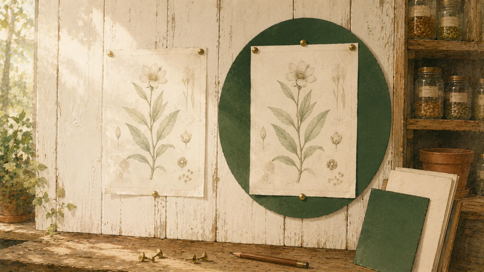
I put a moss-green ring behind it. That's all. A solid circular disc in the deep green already in the palette, sitting behind the character, sized to the avatar. The artwork is untouched — same file, same contrast, same hat.
Now the pale cream has something to sit against, always, regardless of what page it lands on. The edges are crisp at 64 pixels. On a light background it reads. On a dark background it reads. The character brings its own context with it.
Ten seconds of work, once I stopped trying to fix the wrong thing.
The rule I took from it
When something looks wrong in one context, change the context before you change the thing.
The artwork was never the problem. The artwork was correct, it was correct at full size, correct at 64 pixels, correct on dark. It only failed against one specific condition, and I responded by altering the part that was working in every other condition.
This shows up constantly once you look for it. A chart that's unreadable on a projector doesn't need different data. A paragraph that doesn't land in an email might be fine in a document. Before rewriting the thing, check whether you can change what it's sitting on.
That's the end of this run. We've covered what's in Oregon's public data, who's reading it with us, and a fair number of ways to get it wrong. The building continues — and when the next batch of mistakes is ready, they'll be written down too.